Gender Gap in Town Council Survey
Statistical Analysis
Dashboard
A Dashboard summarizing the findings of the report is as shown below.

The above dashboard provides a summary of the findings that were arrived at in the task. According to (Atre, 2014), a dashboard aids in providing general information to a person at a glance without having to go through each finding.
Analysis of Male and Female respondents

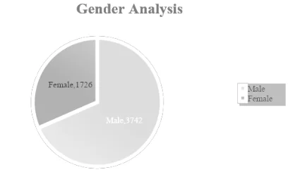
This study considers the following general response in a bounded population. From the analysis above its shows that form the town council there were many Male respondents as compared to the female respondents. The graph shows that there were 3742 males respondents while the female respondents were 1726. In the Included table all parties included was counted as per their gender and concluded with the above information. From the above information, it can also been seen that the male respondents represented 68% of the total respondents whereas the females represented 32% of the total respondents. The use of a pie chart of represent the findings provides and easier way to represent the information to a reader at a glance (Howson, 2016).
Readability Measure analysis

The above is a statistic of how the response was evaluated considering the readability of the response that the respondents gave in the survey. The information received from those who responded showed that a larger number of residents gave childish responses as compare to those who expressed themselves in a more understood way. Despite being childish in their response other also responded with complex information that tend to be difficult to understand. Below is a graph that shows exact trend of the renounces.

From the above graph, it can be seen that 366, of the content supplied was unreadable, 854 was difficult to read, 1115 was the number of ideal responses, 1514 was the acceptable response whereas 1641 was the number of responses that were categorized as childish. It can also been seen that the response that was categorized as childish represented the bigger number whereas the unreadable response represented the smaller number. The bar graph used to represent the above data provides an easier way to represent the data and also an easier way of understanding the data.
English Text Flesch Analysis
This analysis focused on how easy or difficult the text that was used by residents was either easy or difficult to understand depending on the circumstances that were encountered. From the respondents, the English test has different levels of difficulties that included: easy, fairly easy, plain, fairly difficult, difficult and very difficult. From the table below the score rates text on a 100 point scale. The higher the score, the easier it is to understand the text. The table also analysed the scores and categorized in a scale of 80 to 100 as Easy then the lowest level on the scale was 0 to 49 as Very Difficult. Count column is the summation of the frequency of the key word on the grand dataset file that had all the gathered data.


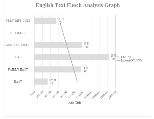
From the above graph, it can be seen that the number of respondents who said that the English test was easy was 325, fairly easy was 1151, plain was 1848, fairly difficult was zero and very difficult was 531 respondents. From the above graph, it can be seen that the majority of respondents said that it was plain difficult and there were zero people who said that the findings were difficult. The above method used to represent the findings can thus be said to be efficient in providing data at a glance.
The Formality Statements
In Text formality the analysis bring out clearly how the residents were familiar with the English components that were used in the texts provided during the survey. The analysis generates a useful information that proves that the residents are formalized with texts on context independent texts that are mostly used on newspapers and scientific articles thus it’s of an advantage if information could be passed through magazines newspapers and scientific articles.


The formality graph used to represent the above information provided a clear analysis of the results obtained from the results of the text formality analysis. In all the sub categories that were analysed, prepositions in each category were seen to have the highest degree of formality. Conjunctions on the other hand can be seen to have the least degree of formality in all the sub categories. The newspaper category can be seen to have the highest formalities in all the sub categories that were being examined as compared to the other categories. In can also be seen that oral females have the least level of formalities in all the subcategories that were being examined in the analysis.
Residents Mentions
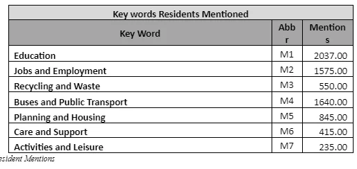
Above is a summary of all the topics that the residents mentioned during the survey. Majority of the residents mentioned about Education while the minority were for Leisure and Activities. From these analysed data, it concludes that life within the resident area would be made better by getting educational resources to the residents because many of them spoke or mentioned a related topic to Education. Education would make life better as concluded by the study. According to these results Literacy not only enriches residents individual’s life, but it generates an opportunities for an individual to develop skills that will help in improving themselves and their interested parties.

Apart from Education other residents are forecasting that life would be better with improved business and transport systems.
Personality trait Analysis
According to the survey there were “Big 5” personality trait sported and amounted to a very good summary of the information gathered. These traits are as follows
Extraversion Emotional stability Agreeableness Conscientiousness Openness to experience
The summation of the traits collected would amount to the table below that summarizes all the information within the dataset. From the summarized data many residents with Agreeableness trait were outstanding among others. The least noted trait was Extraversion thus the Monmouthshire County woul make the conuty better by making thing to be in an open and truth of what they have experinced.
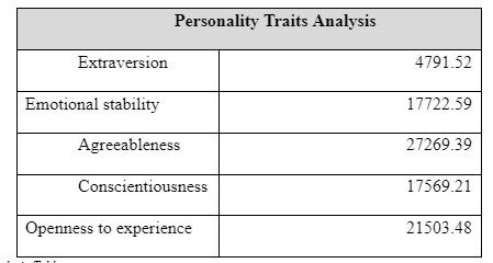
The information can be expressed well on a graphical representation where I describes its own self.

Form this graph its dirrectly portraing the residents traits clearly that many of the residents are easy to agree with decisions made by the county administratoion. And by this this can really make it better for the residents within the county. The recommendation to the county will that they should engage the residents to the decisions thay make because most of them are on a ground to accept and agree with the decisions they make.
The mean and standard deviation
The mean is the average of the information that was obtained from the all the features or the key fields that were used in the survey, where you add up all the numbers of the specific feature and then divide by the number of its occurrence of frequency of the field. From the table below this shows the summation of each individual feature then it’s taken over the total number of its occurrences or its frequency within the dataset. Beside it there is the standard deviation which is just one that statististically tells you how tightly all the various feature are clustered around the mean in a set of data. When the examples are pretty tightly bunched together and the bell-shaped curve is steep, the standard deviation is small. When the examples are spread apart and the bell curve is relatively flat, that tells you have a relatively large standard deviation.
Mean Standard Deviation

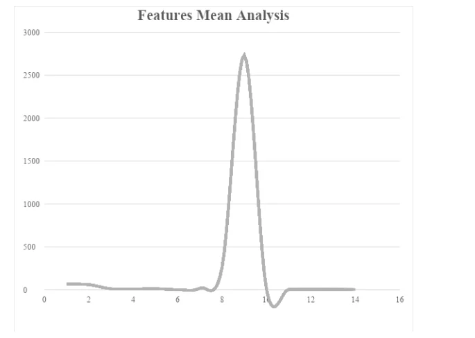
The above data is included on a line graph which directly represents the analysis of the data taken over the mean that was computed. And directly mimics the Standard deviation curve which is always in a bell-shaped form.
Frequency Curve
Frequency Distributions

This table gets the frequency in which each resident mentioned a particular phrase which actually may be used to analyse what topic the residents really talked about This table represents an organized tabulation of the number mentions that are in each category on the scale of measurement. The distribution can be structured either as a table or as a graph, but in either case the distribution presents the same two elements:
The set of Mention categories that make up the original measurement scale.
A record of the frequency which was recorded from the data set.

From the graph what is noticed is an increase and fall of the number of time that a certain mention was involved within the survey. M7 is the most mentioned as seen from the graph.
OLAP
Importing Date to Access Database
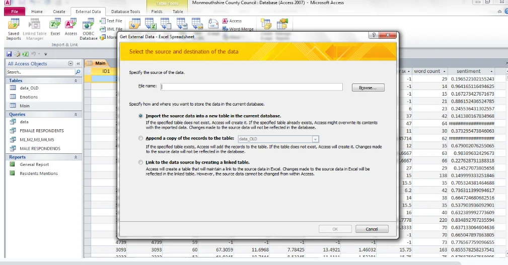
Here we are importing our data set from Excel file to an access database that will hold the data and enable execution of several queries to the data for more options and manipulations. The imported Table is named as main.
Queries for supporting the report
Query 1: query the database for all the female respondents
SELECT Main.id, Main.formality, Main.flesch, Main.fog, Main.kincaid, Main.[percent complex words], Main.[syllables per words], Main.[words per sentence], Main.[word count], Main.sentiment, Main.sex, Main.extraversion, Main.agreeableness, Main.conscientiousness, Main.[openness to experience], Main.longitude, Main.latitude, Main.A, Main.B, Main.D, Main.E, Main.[emotional stability] FROM Main WHERE (((Main.sex)=2)); --the gender is used as the key value—

Query 2: Gets all the respondents who mentioned at least 5 mentions at different instances within the survey.
Simply shows the mentions that were all filled up which can be used for a summary of all the respondents who are likely to benefit and involve in the making of the county a better place and to make sure there is a better life for them
SELECT Main.id, Main.formality, Main.flesch, Main.fog, Main.kincaid, Main.[percent complex words], Main.[syllables per words], Main.[words per sentence], Main.[word count], Main.sentiment, Main.sex, Main.extraversion, Main.agreeableness, Main.conscientiousness, Main.[openness to experience], Main.longitude, Main.latitude, Main.A, Main.B, Main.D, Main.E, Main.[emotional stability] FROM Main WHERE (((Main.A)=1) AND ((Main.B)=1) AND ((Main.D)=1) AND ((Main.E)=1)); From the two queries there was also a general report that generated all the features that were involved in the survey, and also another report that was summarizing all the residents’ mentions.
Geographical Analysis
Standard distance deviation

The mean center, geometric mean, and harmonic mean fall almost on top of each other; however, they will not always be so. The center of minimum distance approximates the geographical center of the distribution. The triangulated mean is defined by the angularity and distance from the lower-left and upper-right corners of the data set

The geographic centre of male and female respondents shows a set of points as adjusted for a value that is associated with each point. The best line of fit balances all the noted geographical pin points where the responses were receive from those who were involved in the survey
Mean centre and Median centre
From the above image both the centre distance and the median centre are below that of the mean centre, this shows that there is a little more respondents from the southern part of Monmouthshire County Council (MCC). The difference is that statistics is very on the median centre and the centre of the minimum value.


Centre of minimum distance
The centre of minimum was calculated on the given data and the results were as shown in the below figure.


In conclusion, the use of statistical graphs and tables has proved to be useful in aiding in the analysis of data. The different graphs that have been used in the study have aided in the providing a better understanding of the data that was initially presented in the excel format. According to (Wong, 2014), presenting data in figures and tables aids in providing a better understanding and this has been seen on in this work. In order to make the work better, and provide more understanding of the data, tools that enhance live data analysis such as Tableau can be adopted in future. The tool can aid in providing a real time dashboard that is interactive.
References
Atre, L. T. M. a. S., 2014. Business Intelligence Roadmap: The Complete Project Lifecycle for Decision-Support Applications. 5th ed. New York : s.n.
Eckerson, W., 2013. Performance Dashboards – Measuring, Monitoring, and Managing your business. 3rd ed. New York: Oxford Press.
Fawcett, T., 2011. Data Science for Business: What you need to know about data mining and data-analytic thinking. 5th ed. Chicago: Adventure Words Press.
Ross, R. K. a. M., 2012. The Data Warehouse Toolkit: The Definitive Guide to Dimensional Modeling. 6th ed. Boston: Boston.
Wong, D., 2014. The Wall Street Journal Guide to Information Graphics. The Dos and Don’ts of Presenting Data, Facts, and Figures, 12(34), pp. 12-24.
What Makes Us Unique
- 24/7 Customer Support
- 100% Customer Satisfaction
- No Privacy Violation
- Quick Services
- Subject Experts


